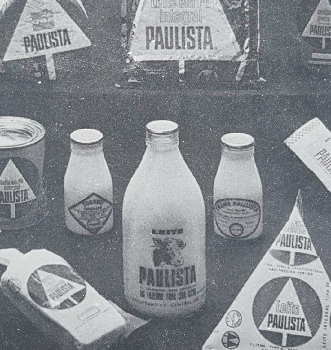
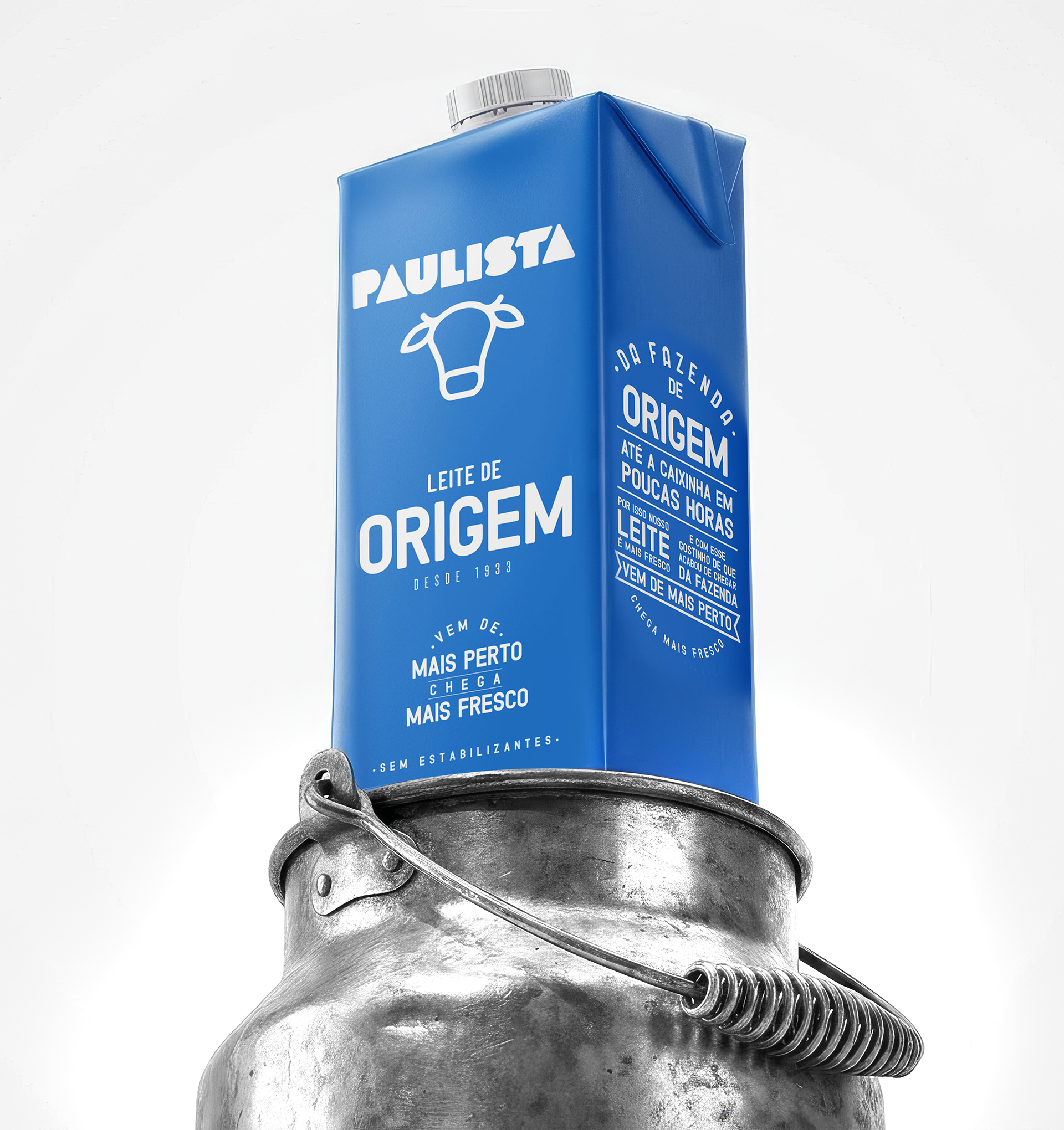
Leveraging long time heritage
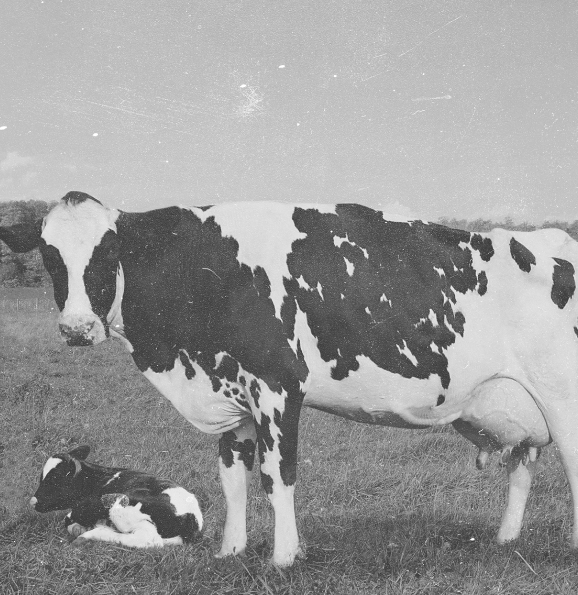
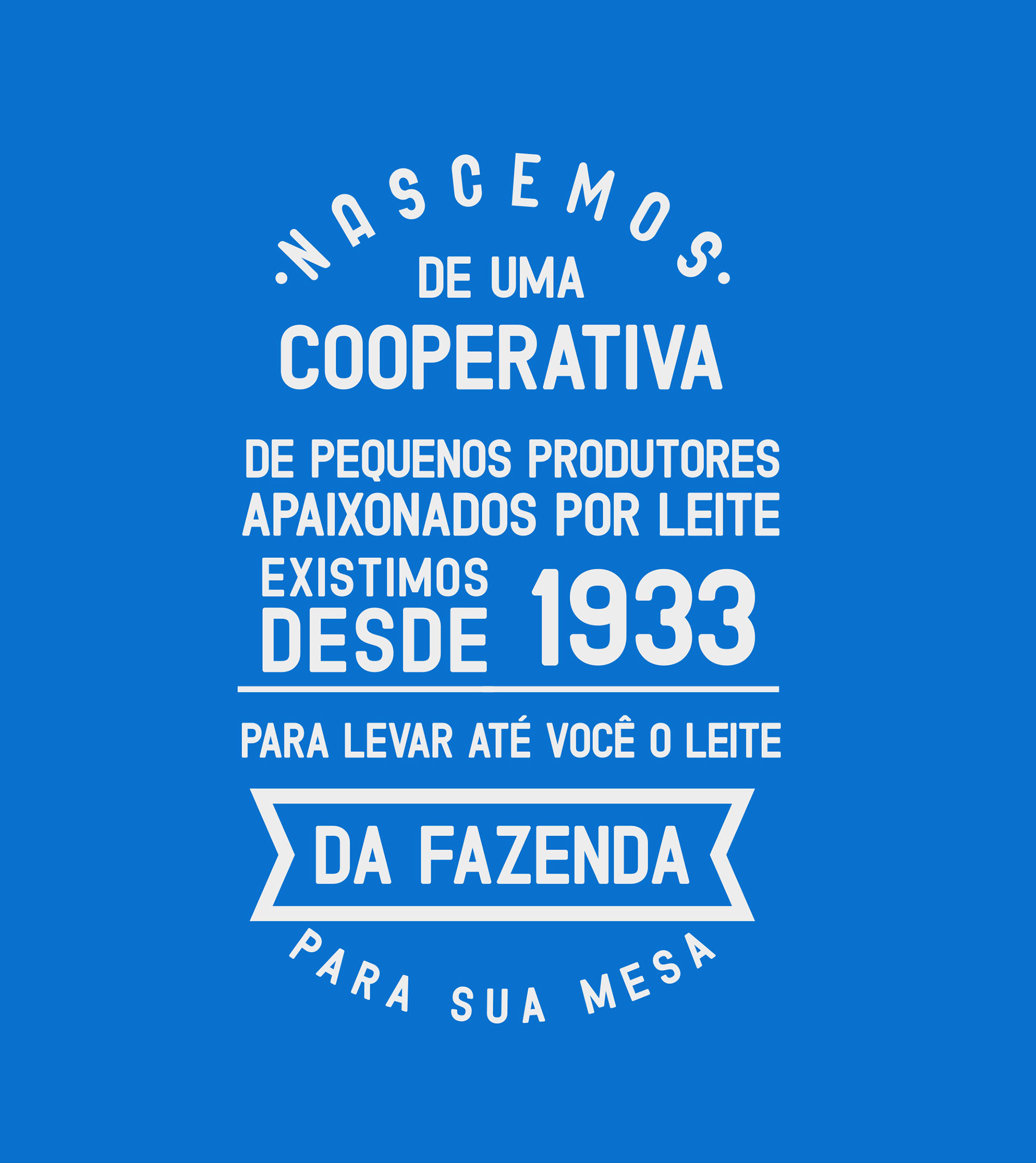
Back to the origins
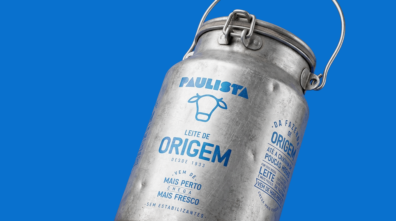
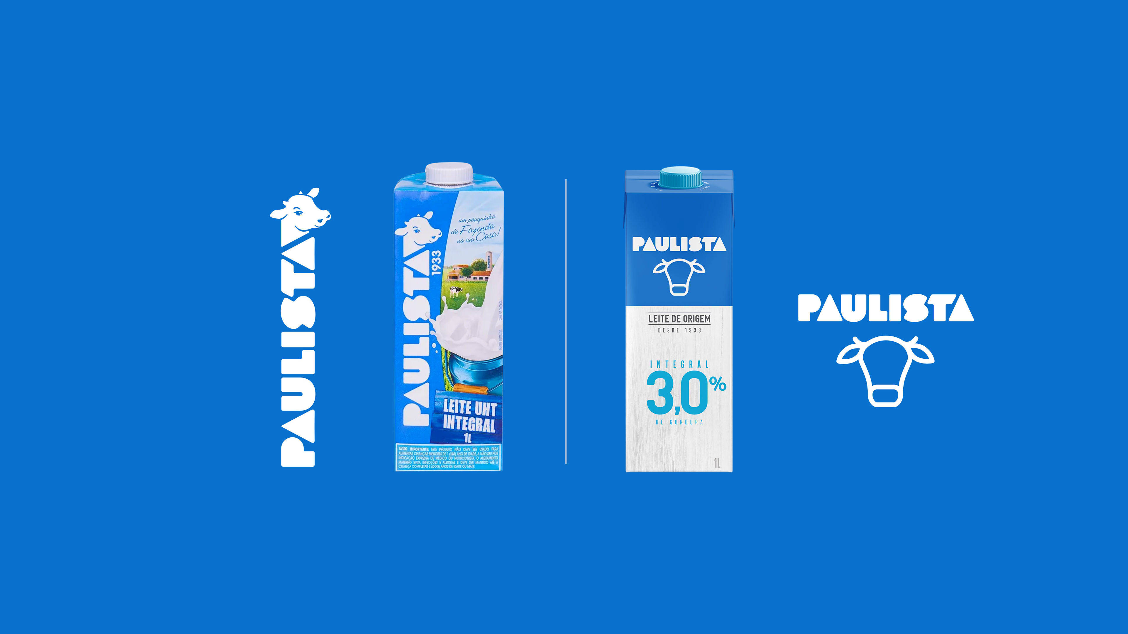
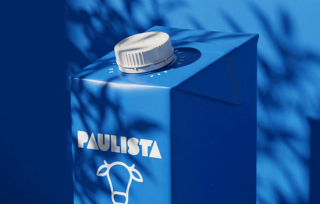
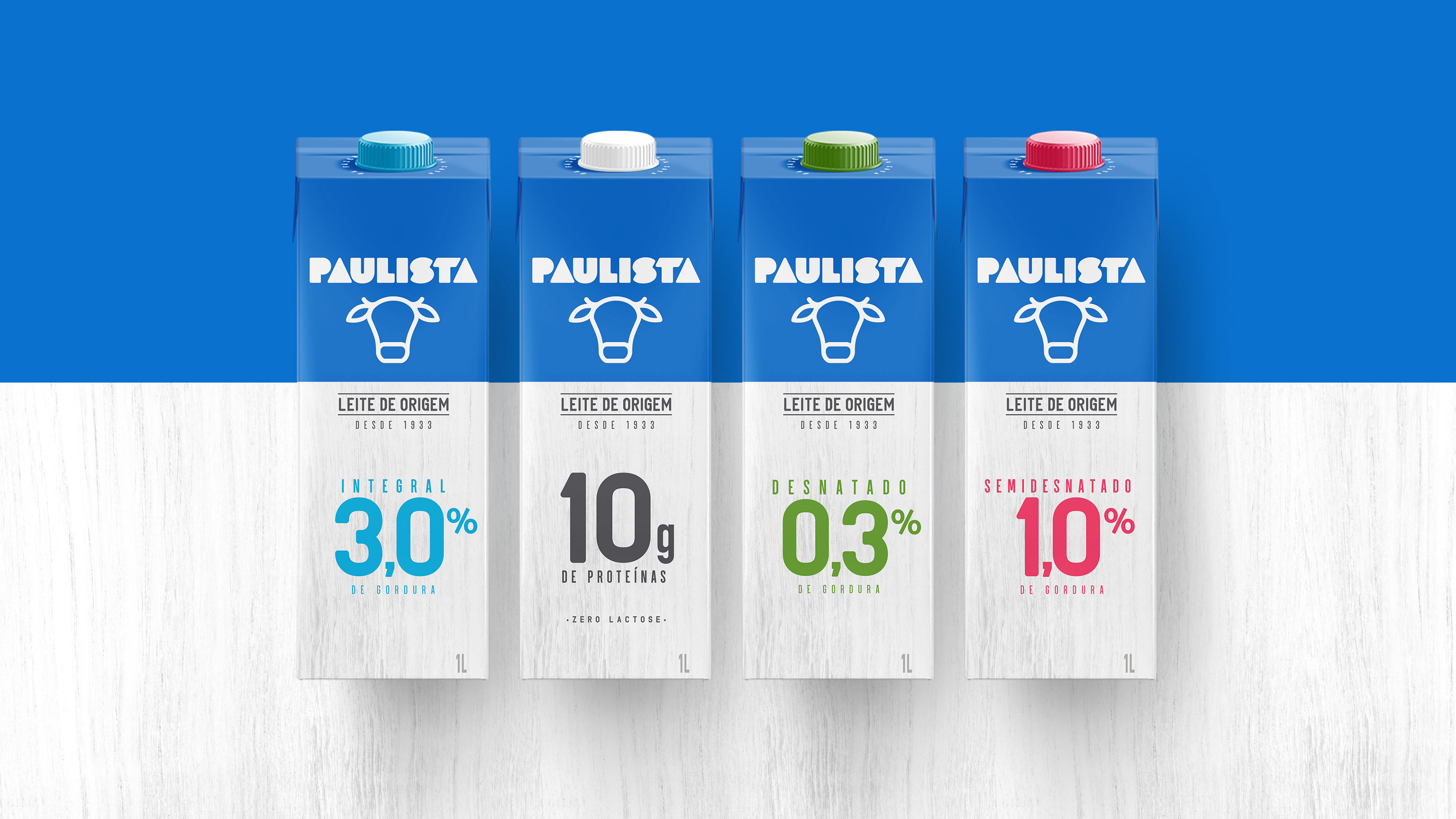
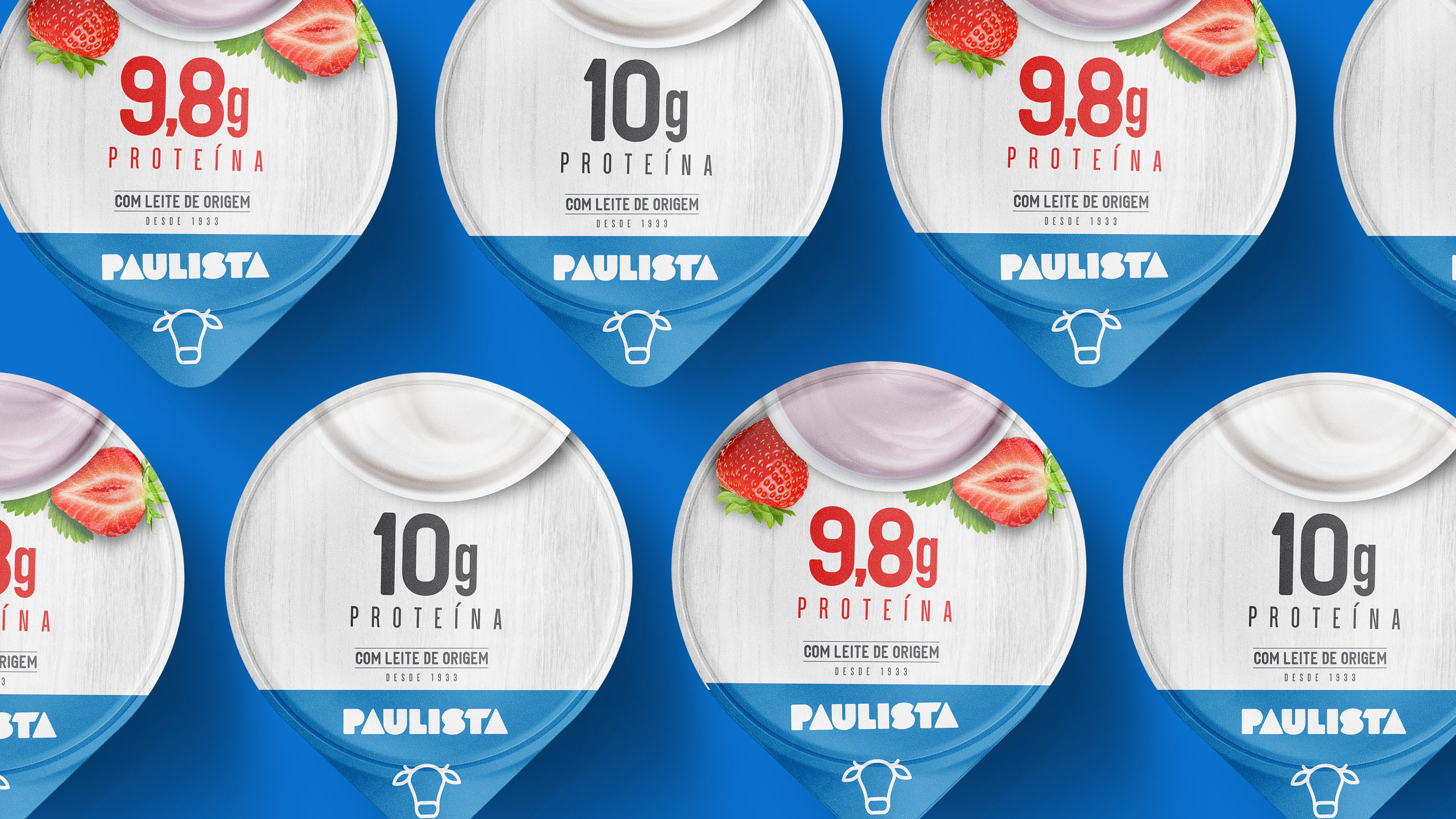
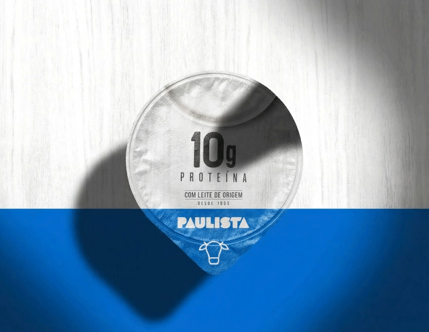
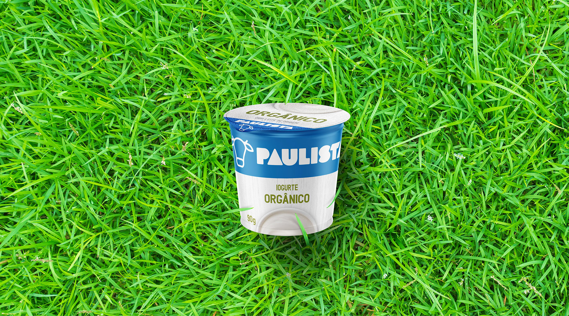
Considering the key symbol on the redesign process development, the “cow” was treated like the protagonist bringing iconicity to the design and personality to the brand, inspired by outlined cow drawings from packages of the past. The 50 years old logotype remained the same as a tribute to the tradition of the brand, leveraging Paulista long time heritage.Therefore, all packages were conceived bringing the most minimalist elements of a farm. The clean label reinforces the freshness and purity of our milk. The white wood panels are there to remind all consumers where the milk come from, a clean, quiet and contemporary farm. The way the ingredients are shown reassures a new perspective, modern, close and sophisticated.
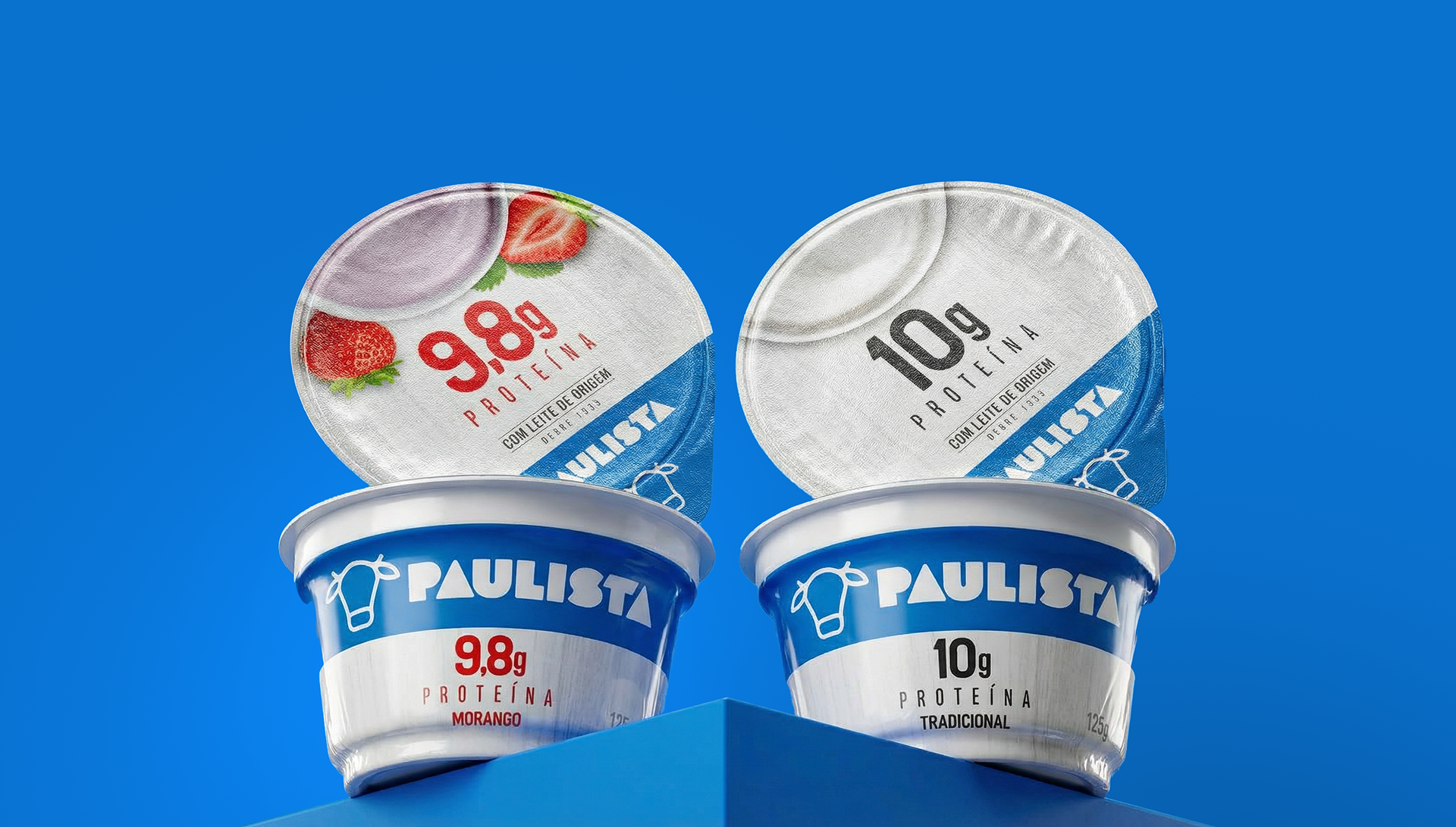

Simple, pure and fresh!

After | Before