What if a flavor could become a symbol?

The identity was built from the product itself.
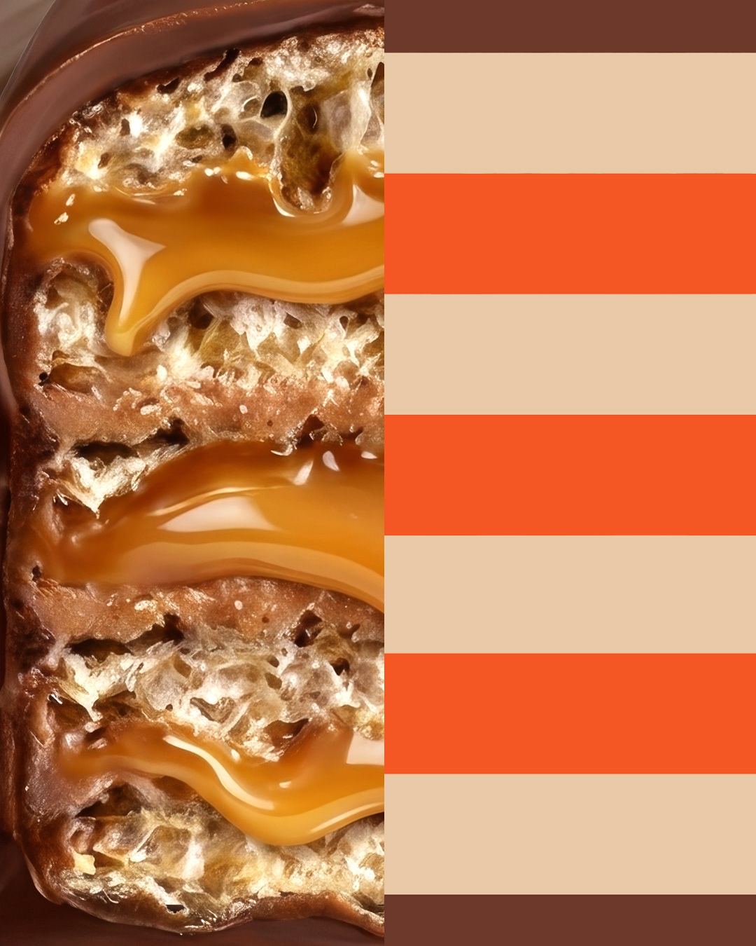

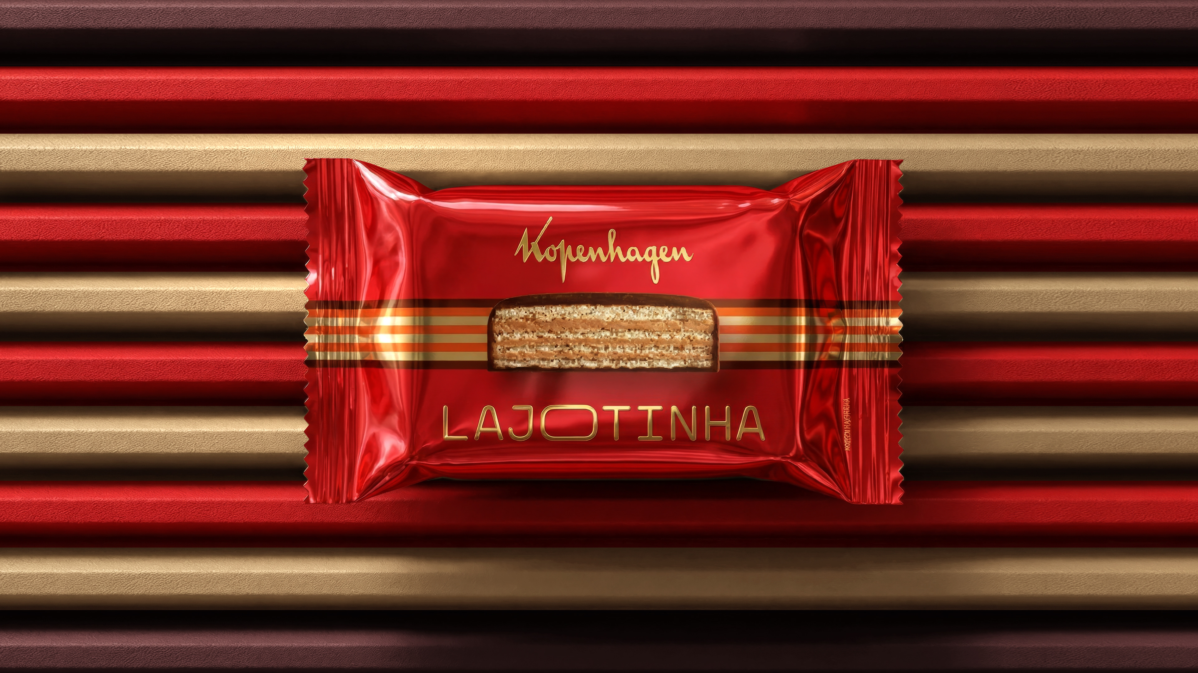
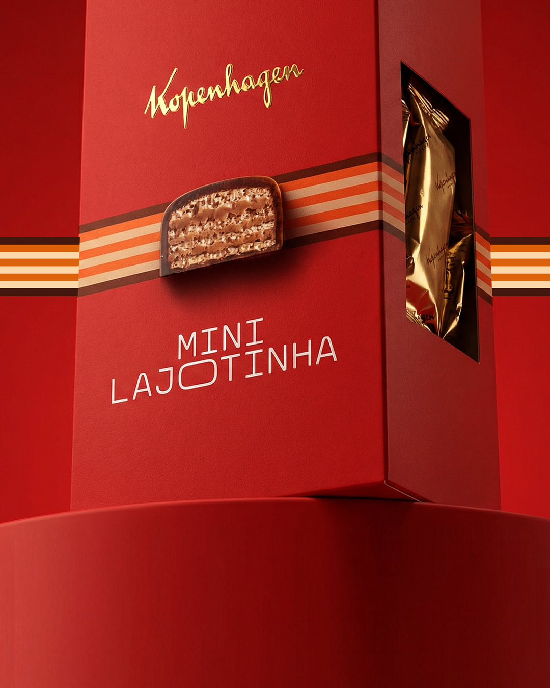
Inspired by the layered structure that defines the flavor chocolate, wafer and caramel.
The design translates these elements into bold, sensual graphic forms. The result is a distinctive visual system that evokes texture, indulgence and movement.
Minimal yet expressive, the graphic language turns the essence of Lajotinha into recognizable brand assets.
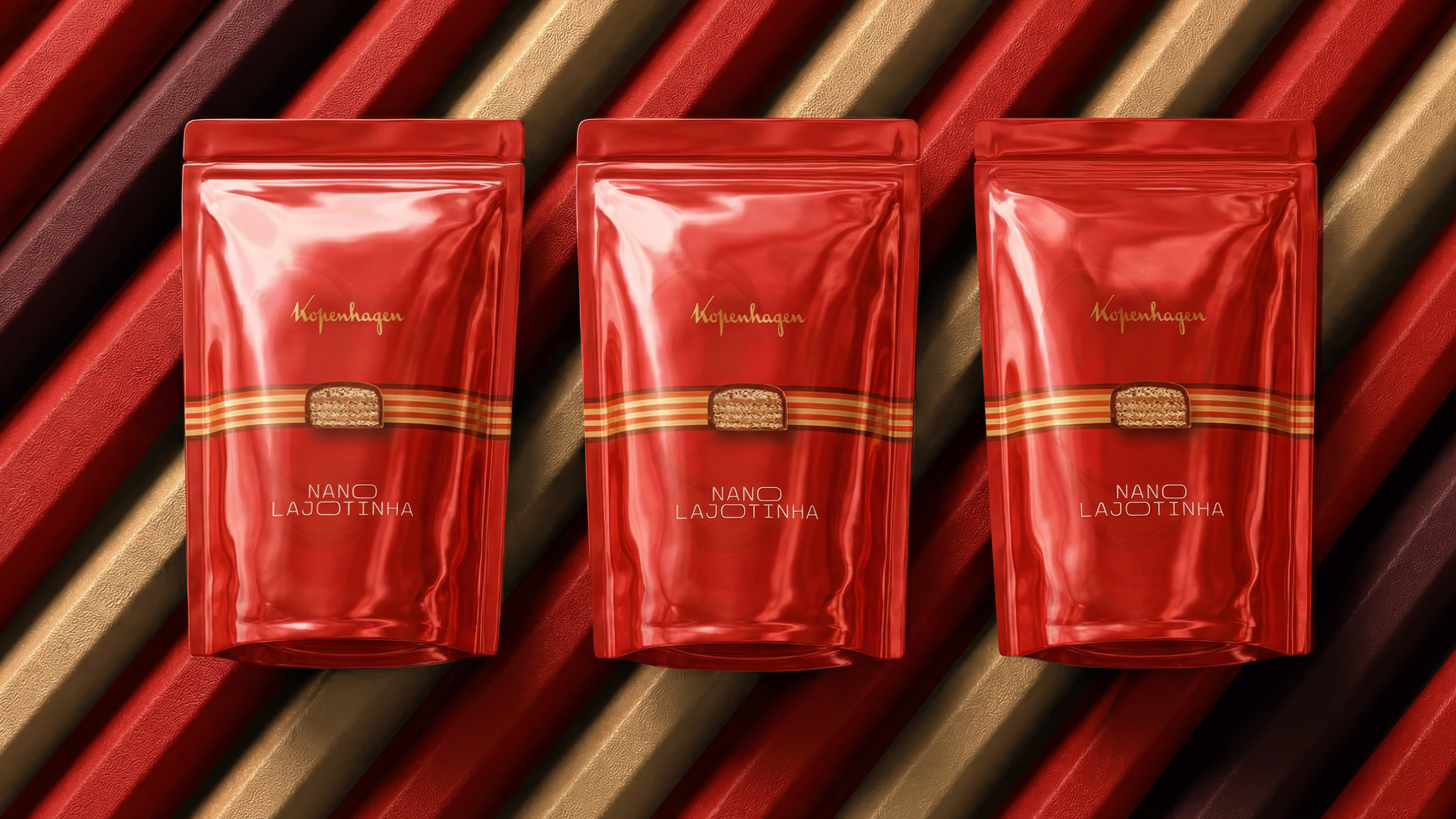
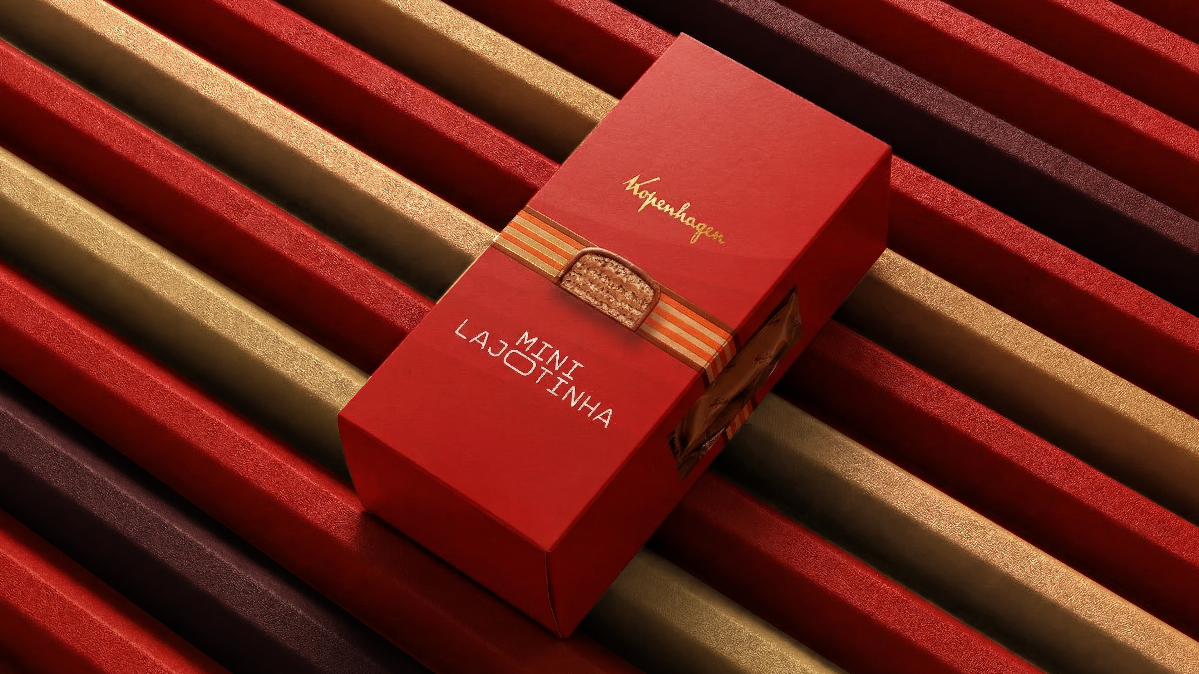


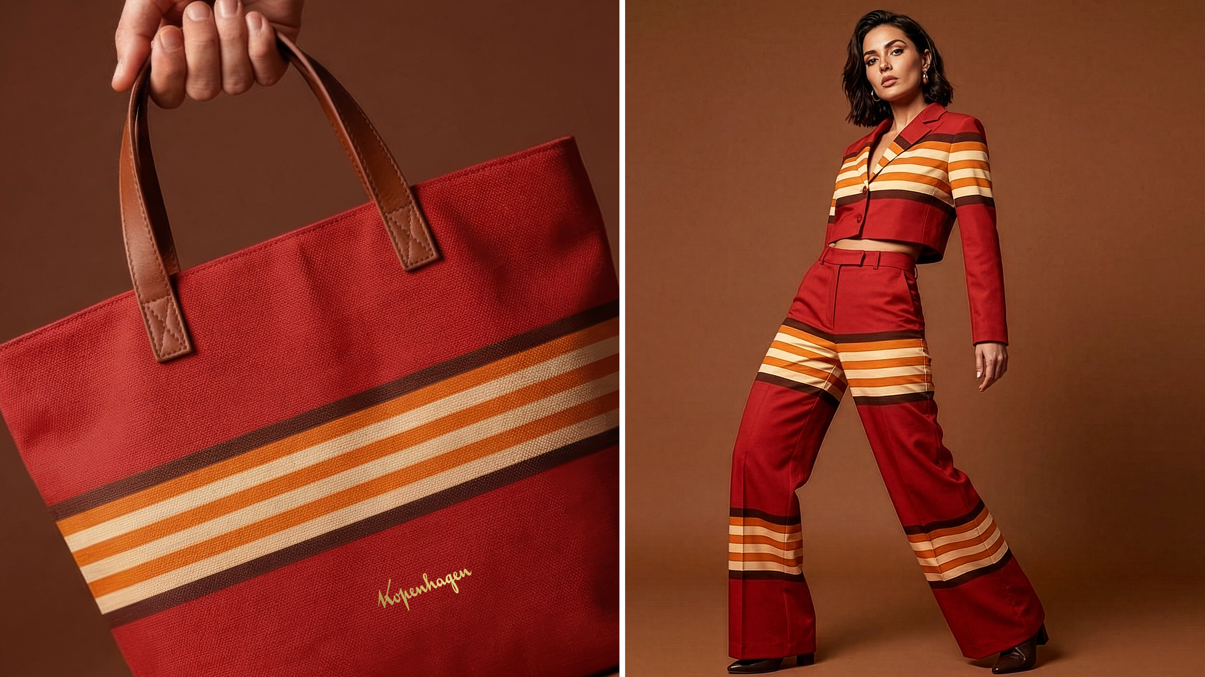
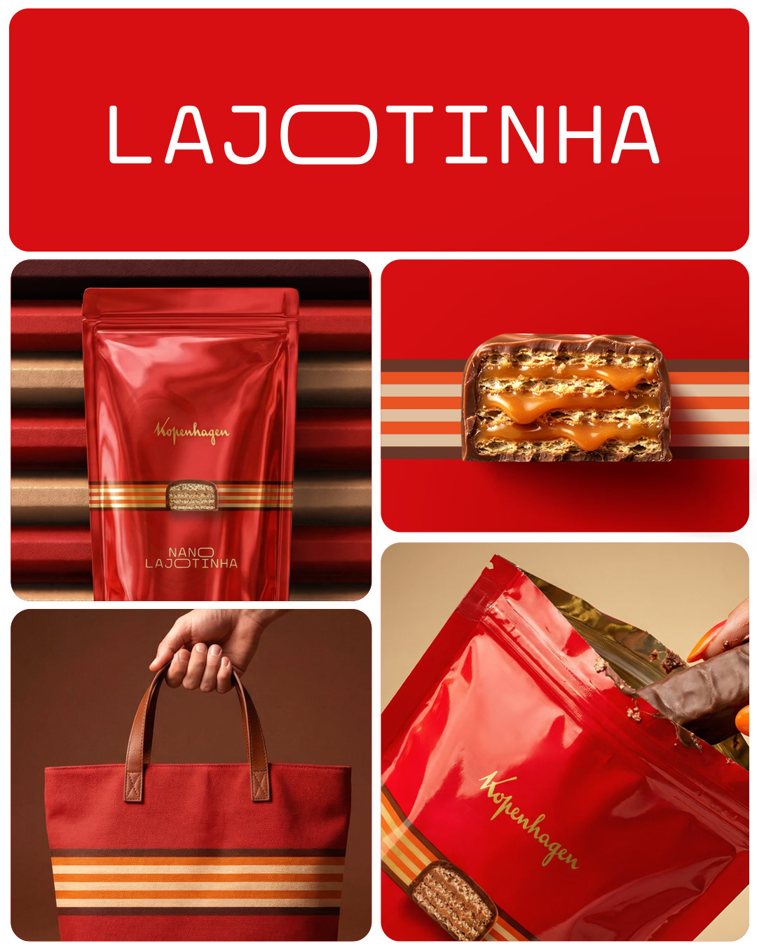
More than packaging, the project establishes a visual territory that can extend beyond the product, enabling future applications across communication, product extensions and brand experiences - transforming an iconic flavor into an equally iconic identity.