Heritage is not something to preserve in the past. It’s something to redesign for the future.

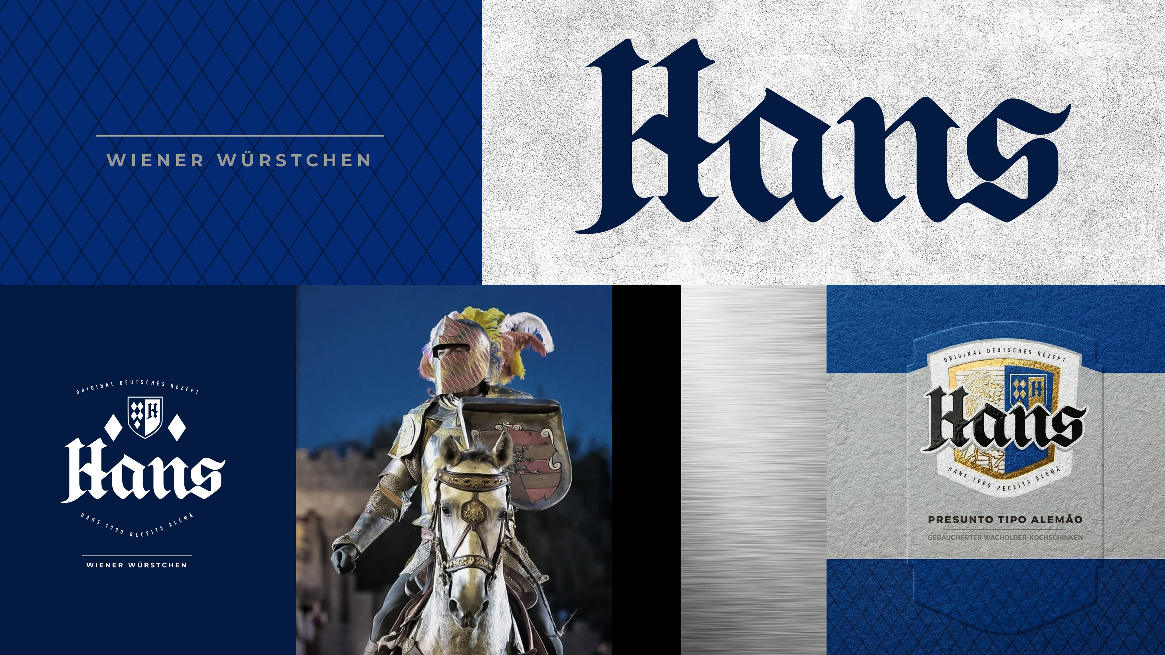
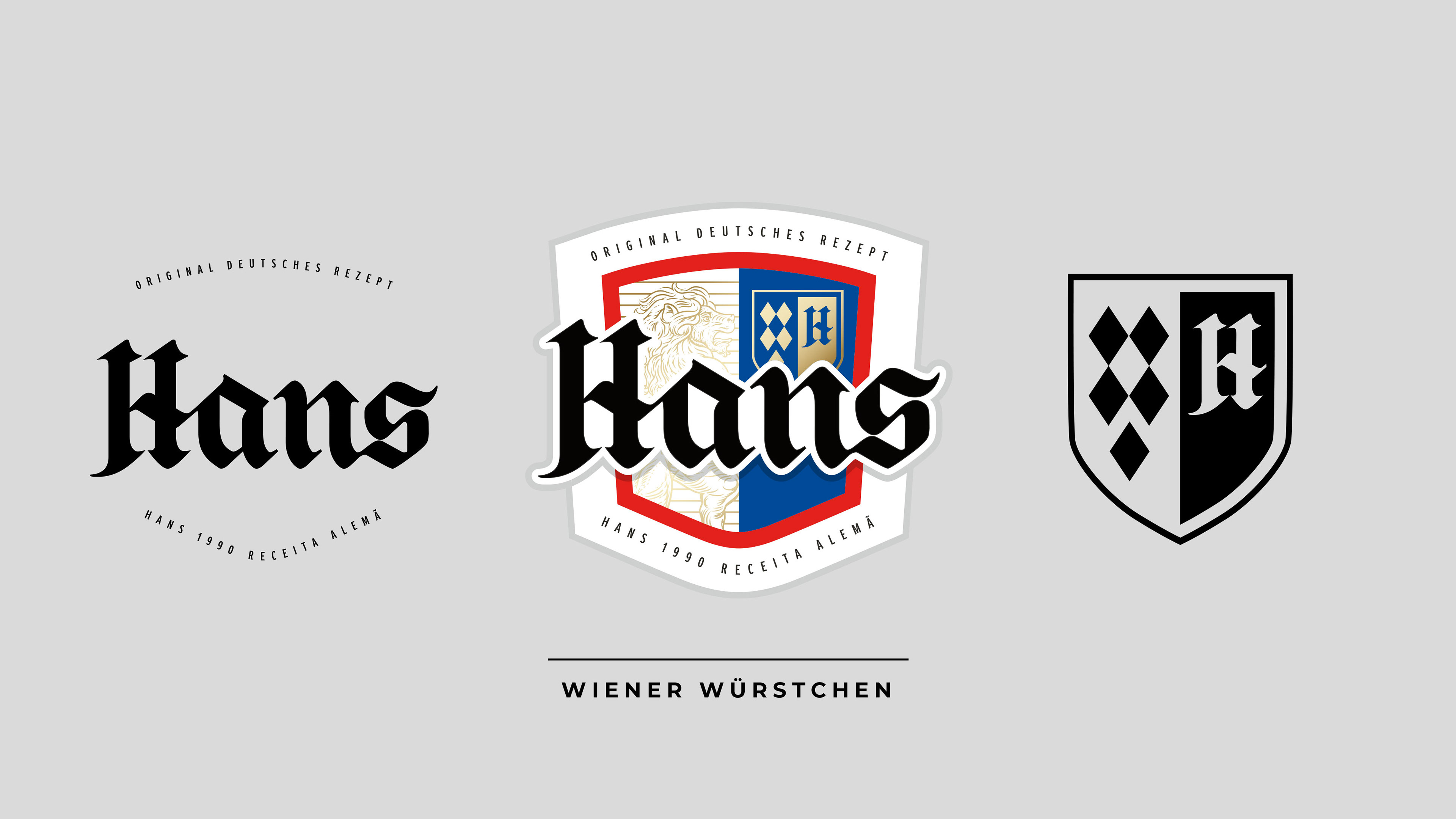
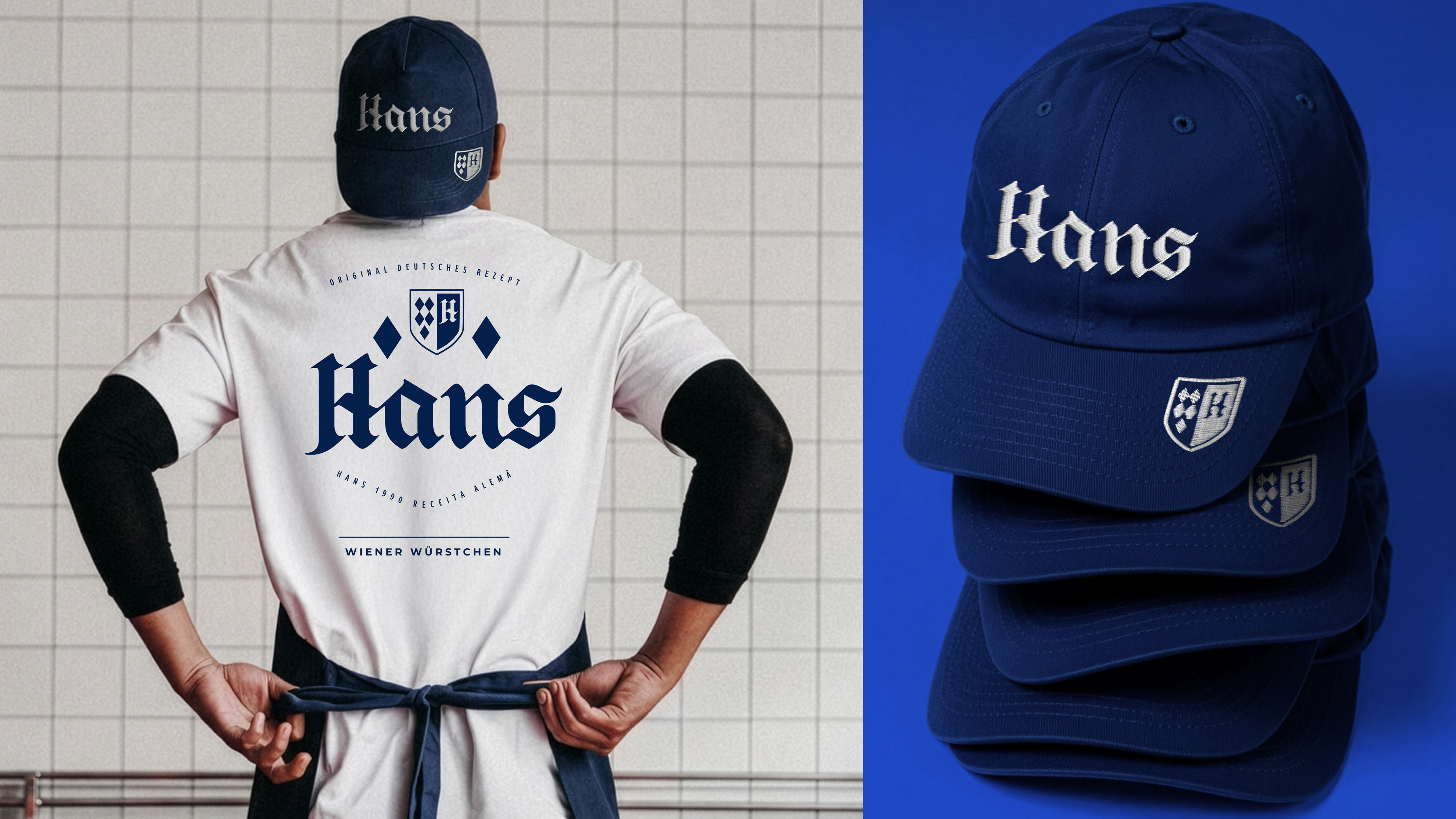
The project began with a reinterpretation of the brand’s original crest, maintaining its traditional character while refining its proportions, drawing and typography to create a more elegant and contemporary identity.


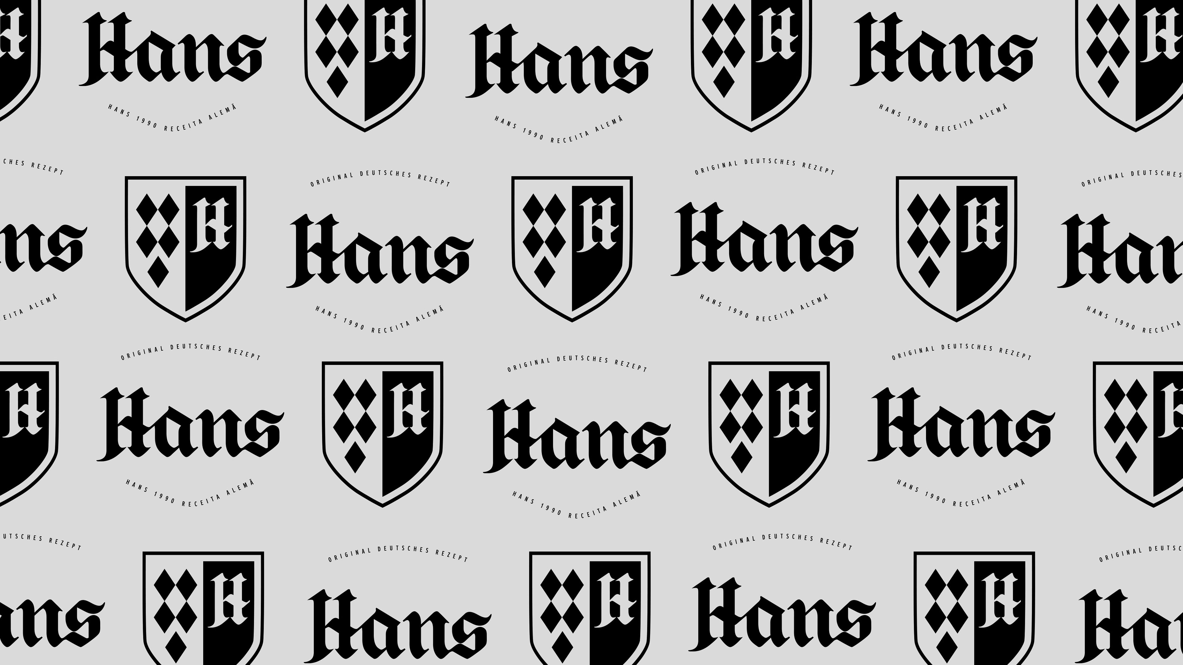
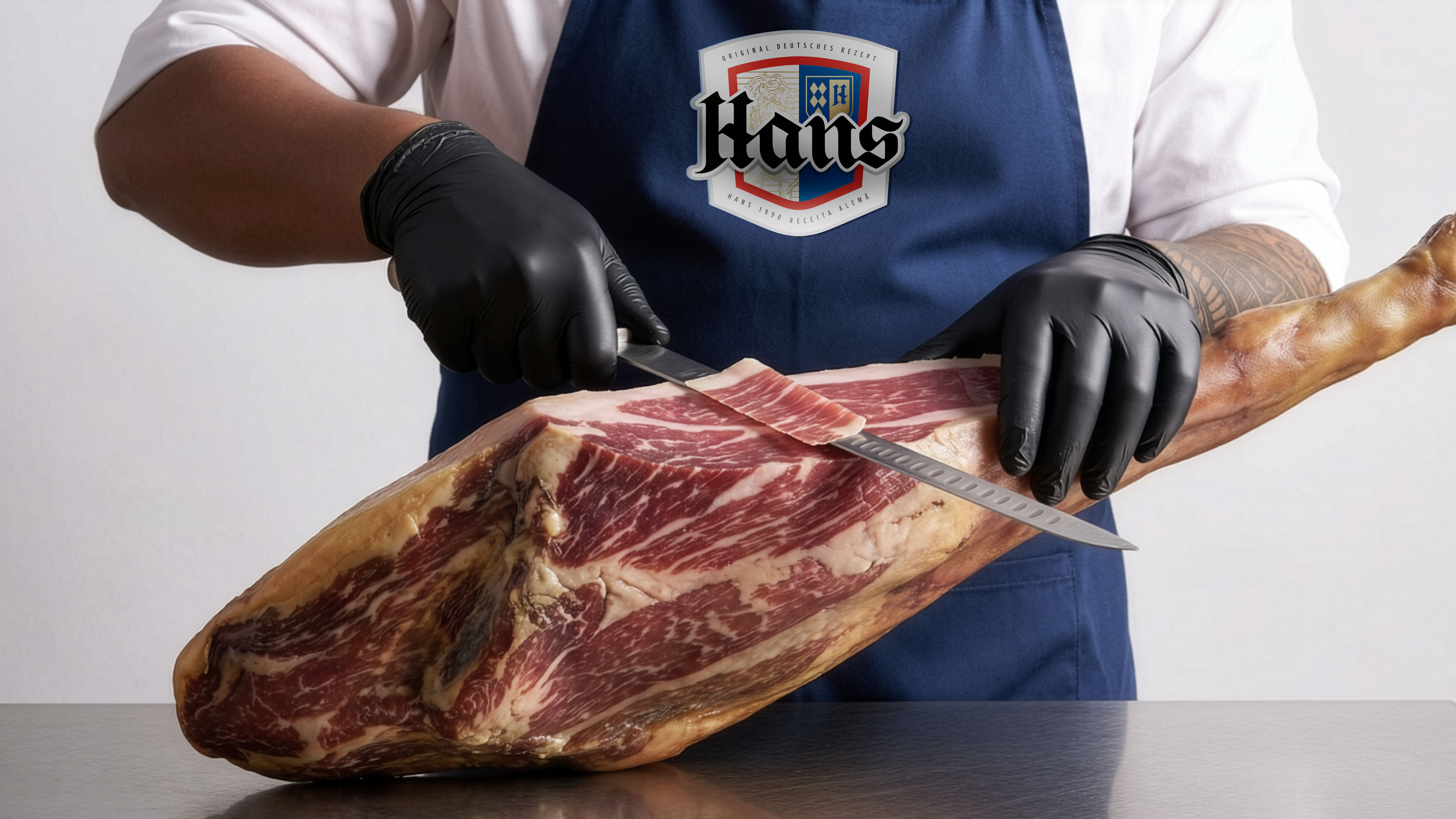
The new visual language positions Hans in a more sophisticated space, reinforcing its origin and expertise in the world of German charcuterie.
To ensure consistency across the portfolio, a clear packaging architecture was developed, creating visual unity throughout the entire product range.


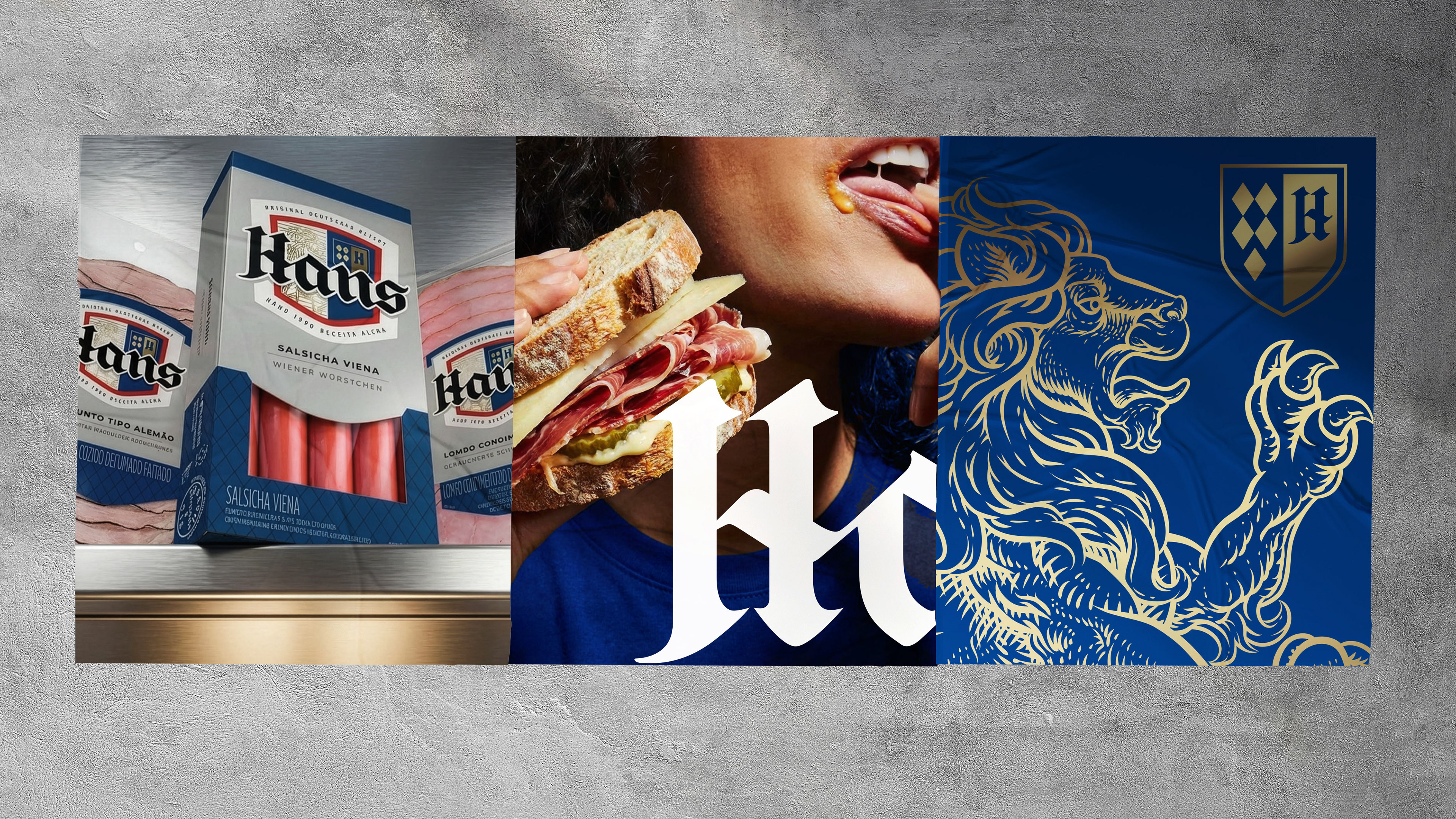
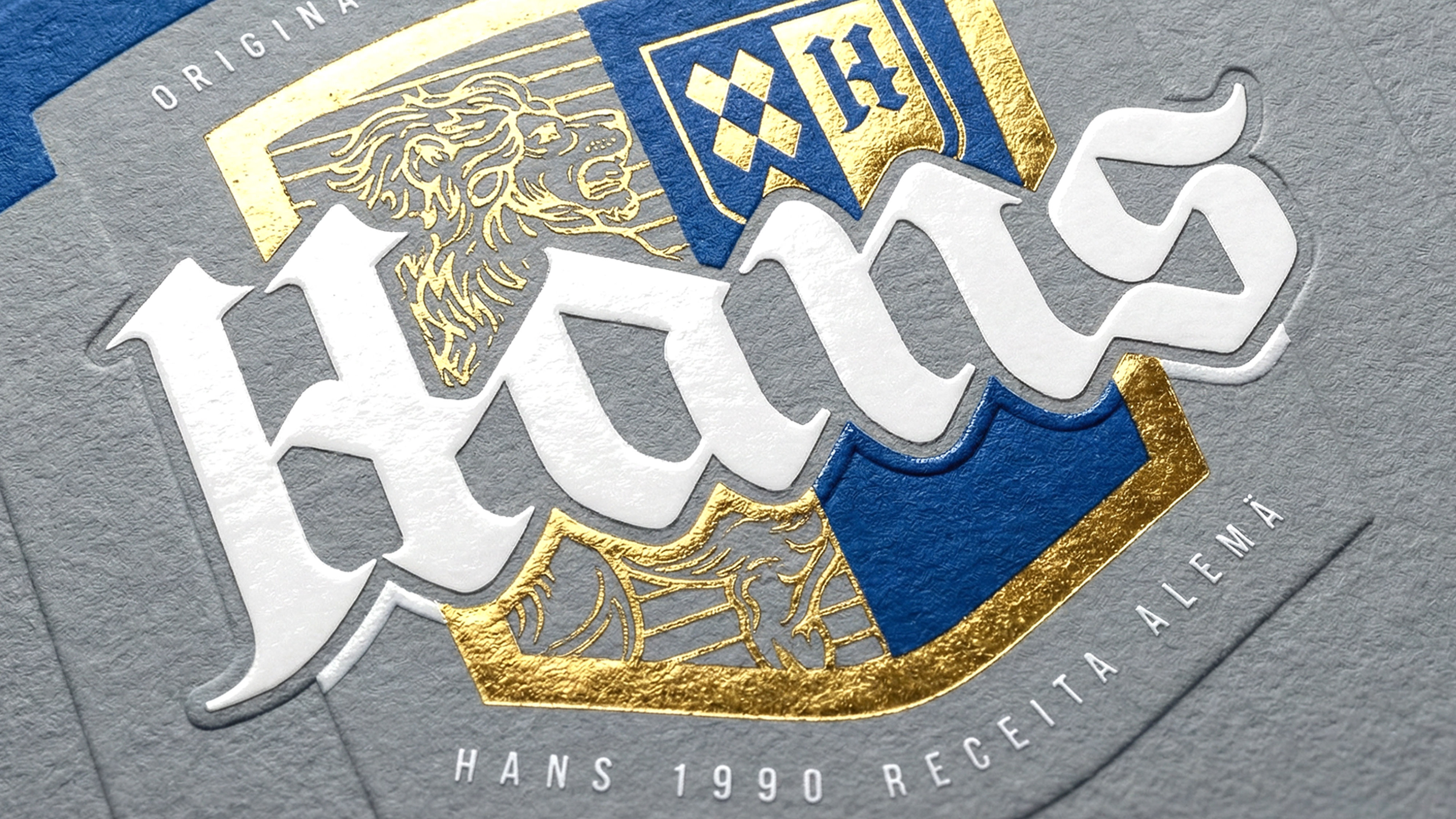
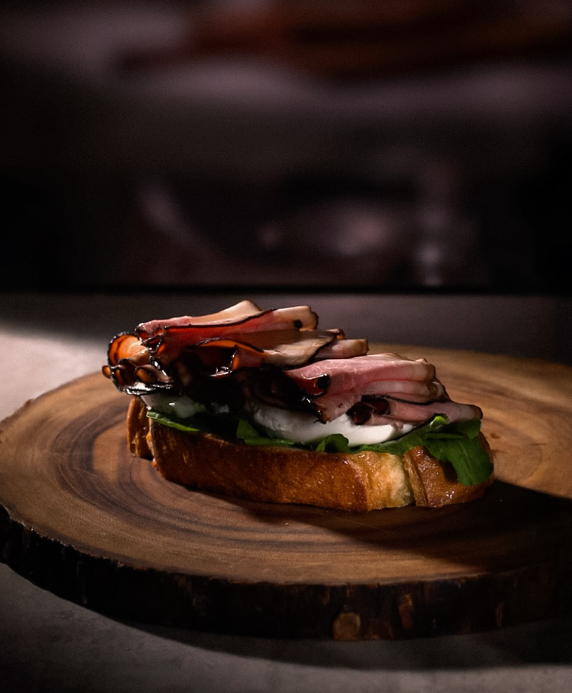
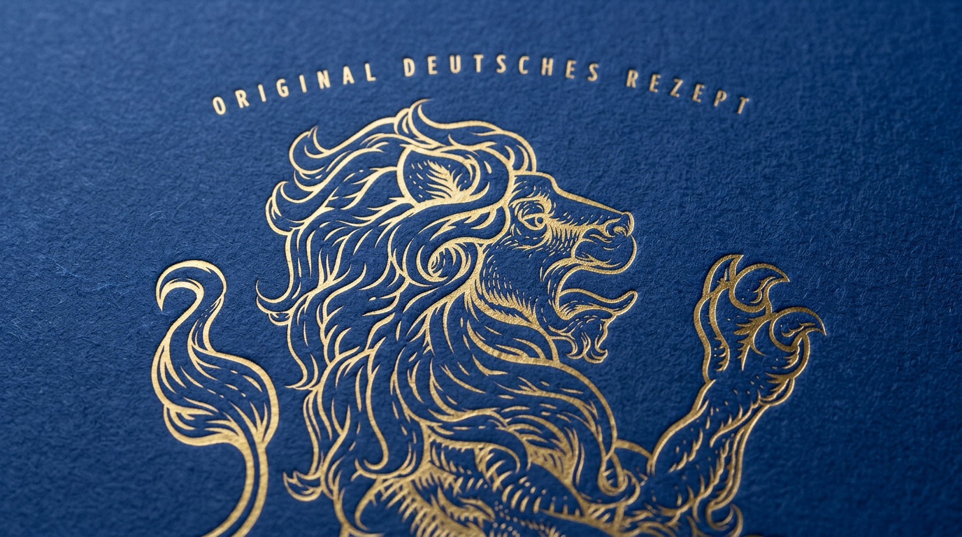
Graphic finishes, details and visual elements inspired by the universe of German charcuterie add personality and authenticity to the system, resulting in a stronger, more contemporary and premium presence on shelf.